How to Make the Color Black Without Black Paint
Black is probably the most controversial color an artist can have on their palette. Some artists swear by it and wouldn't dare paint without it, other artists will have nothing to do with it. We are going to explore the topic of the color black in painting and how to mix the color black without black paint.
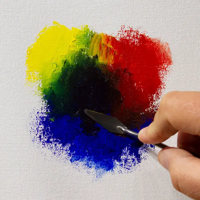
The best way to mix the color black without using black paint is to mix transparent red oxide and ultramarine blue. You can also add a cool red like alizarin crimson for a deeper warm tone. The three colors mentioned can be substituted with pigments of similar color and value.
Let's dive in below and explore the color black, when to use it, and how to mix it.
Do You Really Want Black?
Black is essentially the darkest value achievable and is usually devoid of any color. While absolute black lacks any and all color, we artists should always try to achieve some sort of color temperature with our blacks. In other words, we don't want absolute black in our paintings. What we want is a very dark color that appears black, but still has some sense of color in it.
This desire for some hint of color is the primary reason (no pun intended) many artists (myself included) usually avoid having an actual black such as Ivory Black or Lamp Black on their palette. These pigments by themselves are devoid of any color and when applied by themselves can look dead and out of place in a painting. This becomes really apparent when you apply black in thin layers on white, nuetral, or lightly colored canvas. Thinning your black paint will allow any color or lack of color to become apparent (see examples below).
I want to emphasize that when I'm talking about manufactured blacks looking dead, I'm talking about them being used alone. A good number of artists, living and past masters included, have used black paints such as Ivory Black in magnificent ways. But this was usually achieved by mixing the black with another color, which gives their blacks some sense of color and life. Some artists will also use black to modify or neutralize intense, prismatic colors. We'll touch more on this below.

Why Artists Like to Make Their Own Black
Artists in the never-black camp will usually cite their desire to mix blacks from other colors as their main reason for not using an actual black on their palette. This is a very valid reason (and I admit it's my reason as well) because any black should function as a color within your painting in order to properly express the color relationships and temperature of light on your subject matter.
A representational artist paints what he sees. True black is the absence of all light and color, which means true black represents total darkness or blindness. But since as an artist you are painting something you can see, absolute, colorless black would not be able to truly represent anything in your painting, unless you are painting the inside of a film-developing dark room or what it looks like when you stand inside a dark room with your eyes shut. And even then we don't see absolute black but will still experience phosphenes, that sensation of light and shape produced by mechanical and electrical stimulation during the absence of light. So in essence colorless black is unable to represent anything in our visual reality.
But getting back to visual reality, in many cases, very dark accents within shadows will actually lean toward the warm side of the color wheel. You don't always notice this, but if you paint your darks incorrectly you will notice something wrong with your painting. And because of this, many artists want to be able to control the temperature of their blacks by mixing them.
Black Can and Should Have Color
I have had art students express concern about not being able to make a "true black" that doesn't lean toward any color when they are mixing black. My response is always that artists should make sure their blacks always have some sense of color. You can have a warm black that leans toward brown, or a cool black that leans towards dark blue. You can even have blacks that lean towards crimson or green.
So you may be wondering, "If my black is slightly blue, then is it really black? Why not call it dark blue?" Well, you could call it dark blue if you want, but when the color temperature is barely perceptible, and the value is about as dark as you can go, then we artists tend to just lump that color into the black category.
We basically call anything black that is at the darkest end of the value scale and barely has any perceivable color. But that doesn't mean that it is devoid of any color. So in other words, a color is considered black by how it functions within the value relationships in a painting, by being the darkest value in a painting; it is not considered black by being devoid of all color. In essence, black is just a color whose value is very dark and color significantly neutralized but not completely eliminated.

Mixing Black Without Black Paint
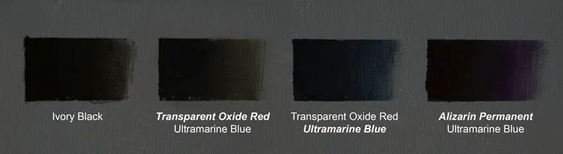
OK so now you are probably wondering how to actually make the color black without black paint. There are a number of color combinations that will achieve black. My favorite combination is Ultramarine Blue, Transparent Oxide Red, and Alizarin Permanent. All three of these colors are very dark and transparent.
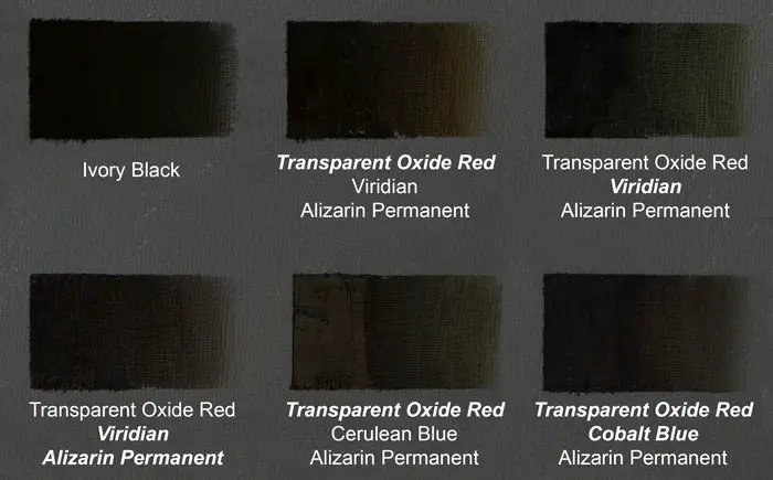
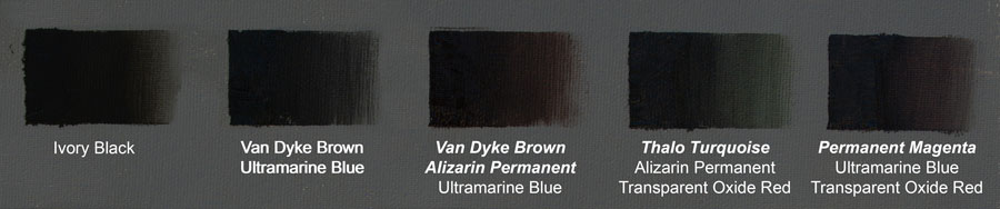
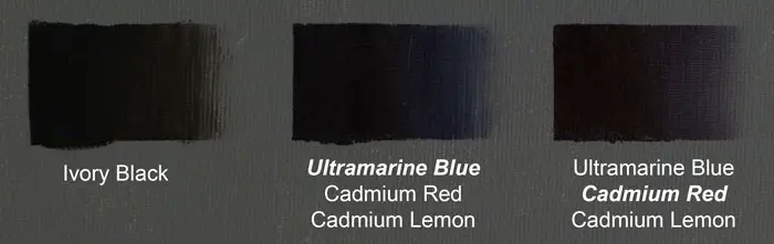
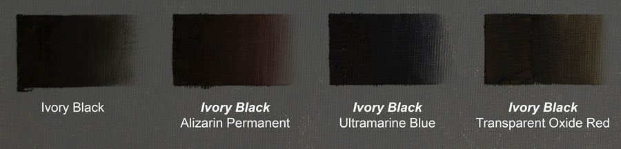
In all my color examples I painted oil on canvas toned with N5 Neutral Gray made by Golden Acrylics so as to better see the color of the black. Each sample shows Ivory Black for comparison. If the mixed black is weighted more to a certain color I bolded and italicized that color. If two colors are bolded and italicized that means there is more of both colors.
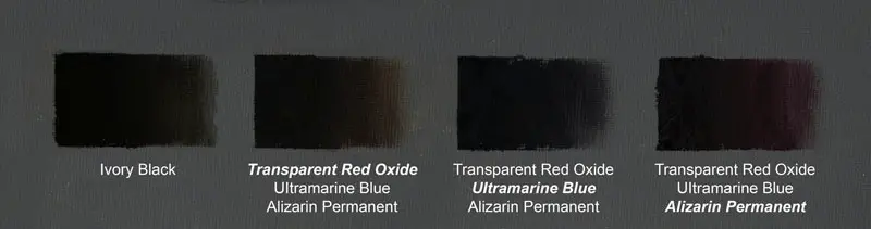
You can substitute Transparent Oxide Red (Transparent Red Oxide as some manufacturers call it) with Burnt Sienna and Alizarin Permanent with Alizarin Crimson and achieve almost the exact same result. One caveat to this is some versions of Burnt Sienna (the more traditional Burnt Sienna) are more opaque and slightly on the pinkish side which will achieve slightly different results. And traditional Alizarin Crimson is a somewhat fugitive color that will fade over time.
Transparency is important because in order to make a paint opaque you usually have to raise the value just slightly. Also, you can make your black opaque by adding a touch of an opaque color, but you cannot make an opaque color transparent. Transparency is also important because if you want a #10 value black (or #1 depending on what type of value scale you go by), a transparent application and result can be more aesthetically pleasing and easier to build upon with subsequent layers of paint.
The great thing about using the color combination I listed above is that it will achieve a very dark, rich black that is very easy to manipulate in the way of color temperature. If you want a warm black (which is usually preferable in most situations) you just increase the amount of Transparent Red Oxide and/or Alizarin Permanent in the mixture. Transparent Red Oxide will give you a more earthy warm and Alizarin Crimson will give you a more atmospheric warm. And of course if blue dominates you will have a very cool black.
Many times I will just drop the Alizarin and use just Ultramarine Blue and Transparent Red Oxide. Being that Transparent Red Oxide is just a very dark, neutralized orange, and orange is the opposite of blue on the color wheel, these two mixed together are sufficient for creating a black that still has some color luminosity in it. If you drop Transparent Oxide Red and just use Ultramarine Blue and Alizarin, you will get a deep cool black that will reveal a purple tone as it gets more transparent.
Mixing An Atmospheric Black
Those deep, dark blacks are great for subjects like still life or indoor figurative work. And while blacks do show up in landscapes, many times they are not nearly as deep or dark as you may think. This is because if you are painting a landscape subject that is further away, the moisture, light, and even pollution in the atmosphere will raise the value of those black and even make them look a bit chalky in some cases.
When I encounter a situation like this, in my black mixture I will substitute Ultramarine Blue with Viridian. Viridian is a very cool green color that is lighter in value than Ultramarine. This works well because the lighter value of Viridian results in a black that is slightly lighter and a little more chalky than one make with Ultramarine. Also, if it's a summer landscape, the green works a little better with the overall color harmony. I may also use a little less Transparent Oxide Red and a little more Alizarin Permanent so that my black doesn't get too earthy depending on my subject.
Instead of Viridian, you can also try using a lighter, cooler blue such as Cobalt Blue, Cerulean Blue, etc. Depending on what ratios you use the results of these different color combinations are very slight.
Different Color Combinations That Achieve Black
Many different color combinations will result in a black color. In theory, any colors that are a dark value and fairly opposite on the color wheel should result in black. Below are some examples of other color combinations that can acheive black.
Ultramarine Blue and Van Dyke Brown will make a fairly colorless black, but adding Alizarin will give it a dark, rust tone.
Thalo Turquoise can be mixed with Transparent Red Oxide and Alizarin Crimson (Permanent) for a deep black. The tinting strength of Thalo Turquoise will give your black a green hue in thin applications.
Very similar to my favorite mixture is Permanent Magenta, Ultramarine Blue and Transparent Red Oxide.
Essentially you can mix a convincing black from most any combination of colors that are dark and on opposite ends or form a triangle on the color wheel.
Mixing Black With Just Primary Colors
A number if years ago, I ditched all colors from palette expect for Titanium White, Cadmium Lemon, Cadmium Red, and Ultramarine Blue. This really helped simplify color mixing for me, but I was also surprised to learn I could mix a convincing black from just these colors (minus the white of course). Granted the blacks mixed from these three colors are not as deep and dark as other blacks and they tend to be a bit more opaque, but they still work just fine.
Mixing blacks from pure primaries will relay heavily on blue since that is the darkest of the primary colors. But I still end up adding just a touch of Cadmium Lemon to cut down on the lavender bias that Ultramarine Blue and Cadmium Red produce.
How to Use Manufactured Black
I want to emphasize that manufactured blacks such as Ivory Black are not to be considered anathema. Just be aware that when used by themselves they can appear dead when used in a painting that has color. One way many artists deal with this is to always mix a color with Ivory Black to give it some life. Personally, I like using Ivory Black or Gamblin's Chromatic Black to tone down intense colors, especially greens. Beyond this I rarely use them, but that doesn't mean you shouldn't use them.
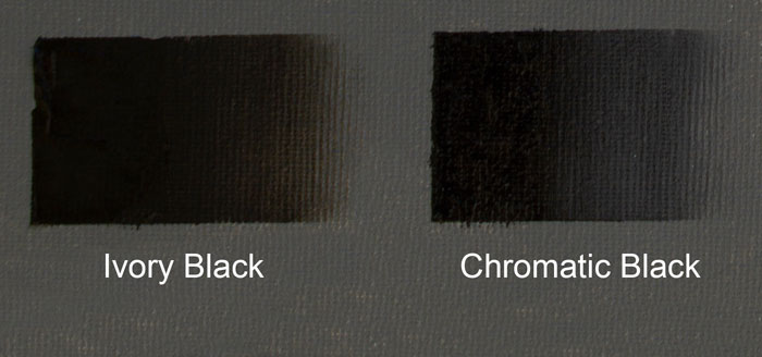
Chromatic Black
Gamblin makes a color called Chromatic Black which is made from opposites on the color wheel. I like this black better than Ivory Black or Mars Black as it has a bit more life and it's not as oily. It seems to be a touch lighter in value than Ivory, but it works great! If you are addicted to black, you may want to try this one.
Warning: Undefined array key "preview" in /home3/mysketc2/public_html/wp-content/plugins/oxygen/component-framework/components/classes/comment-form.class.php on line 75
Warning: Undefined array key "preview" in /home3/mysketc2/public_html/wp-content/plugins/oxygen/component-framework/components/classes/comment-form.class.php on line 79