Seven Secrets for Good Tree Paintings
In most landscape paintings, trees are usually the center of interest or at least a strong element in the scene. Their variety of shapes, not just among different species, but among how they are arranged, can enhance any landscape painting. However, poorly-painted trees can be the number one reason for failed landscape paintings. Among beginning artists, there are typical tree-painting mistakes that are usually made due to a lack of knowledge. In this article, we will explore some of the seven secrets for good tree paintings and how to fix bad tree paintings.
Keep Your Tree Shapes Interesting
One of my earliest memories involving art was in first grade. Some of us kids were drawing trees. I was drawing my trunks wide at the base with a couple of evenly-placed branches toward the top and making squiggly lines for the leaves that resulted in an umbrella-shaped canopy. Fairly amateurish to be sure, but hey, I was only in first grade. However, I noticed my fellow classmates drawing two straight vertical lines topped off with a near-perfect circle. At the risk of sounding pretentious, I remember looking at their drawings and thinking, "That looks more like a lollipop than a tree."
One of the biggest struggles people have when learning to draw is letting go of geometric shapes and seeing the abstract shapes of things as they really are. To get through life we put names to things, and when we start drawing we tend to fall back on that mental concept. Since we can name geometric shapes like circles, rectangles, etc., they can have a nasty habit of clouding our vision and showing up in our artwork. A tree becomes a couple of vertical lines with a circle, a grouping of trees becomes an arrangement of mere humps all the same size and shape.
To really draw trees well, we need to do the same thing we do when drawing any other subject, suspend our intellectual naming of objects and just see the shapes for what they are. These shapes are usually fairly abstract with perhaps a hint of the geometric here and there. The best way to do this is to head outdoors with a sketchbook and spend time drawing trees and really focus on their contour and variety of shape.
Trees Have Volume and Form
We've all heard the saying, "Can't see the forest for the trees", which of course describes one who is lost in the details and cannot see the bigger picture. Besides being a convenient pun, this describes how many beginning and even experienced artists mistakingly approach drawing or painting trees. They get so focused on showing a bunch of leaves or branches and are completely blind to the fact that all those leaves form a big mass of volume and form.
Tree forms (and any form), are shown by light and shadow. Capturing the light and shadow, and hence the volume and form will make your trees look way more realistic than all that detail that you spend hours trying to draw or paint. Of course, you can capture some detail, but it should never be at the cost of light and form.
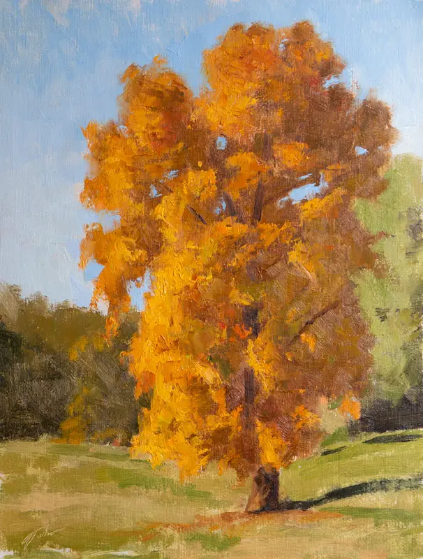
Remember, trees are not just a two-dimensional outline, they are three-dimensional and will have clumps of leaves that are in front of other clumps. This is also shown by light and shadow. Look for this when you are drawing or painting your next tree.
Don't Paint Hedges
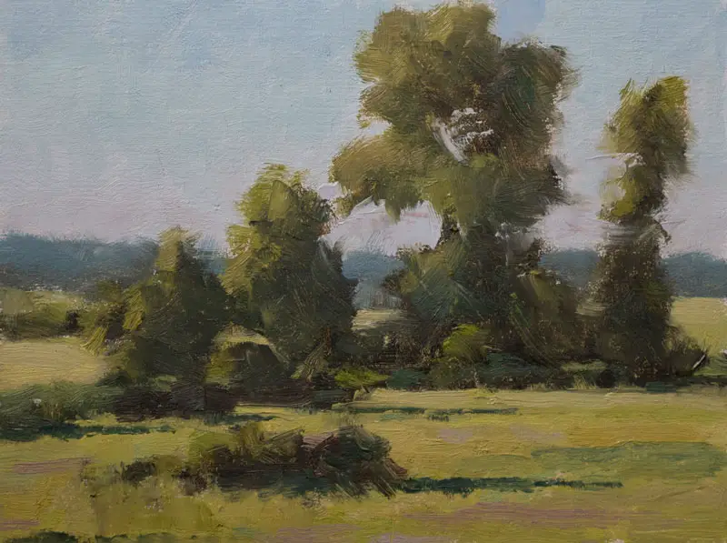
In nature, trees don't usually grow by themselves, but rather in groups or clusters. These groupings will result in unique, abstract shapes that may have the same appearance as a single tree from that same group or species. This is because unlike the hedges people plant on the edge of their yards, groupings of trees in nature don't grow in perfect two-dimensional rows. Rather, they grow all around three-dimensionally.
So when you look at a cluster of trees, you are not just seeing trees that are next to each other, you are seeing trees in front of other trees, partially blocking the trees behind them. This partial blocking of other trees will create unique patterns. So a grouping of spruce trees will not just be a bunch of thin, triangular shapes, but suggestings of triangular shapes mixed with other abstract shapes. Once again the best thing to do is study and sketch tree groupings from life or even from a good photo.
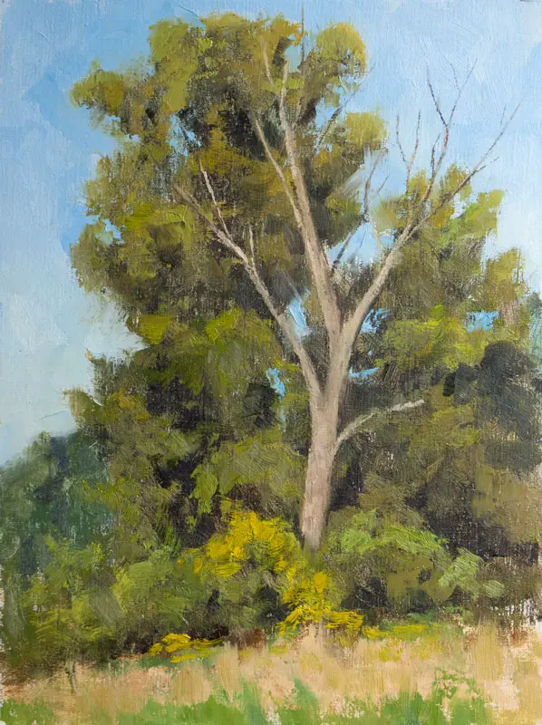
Keep Your Trees a Little Darker
When we look at trees, we are usually looking at them from the ground, which means we are really seeing the side of the trees. Since for most of the day the sun is above us shining down, this means that the side of the trees we see is catching the least amount of sunlight. Since the sides of these trees are usually perpendicular with the direction of sunlight, this makes our trees the darkest value plane in a landscape.
The result is that the parts of the tree that are illuminated by sunlight are still not that light, but rather just a bit lighter than the dark, shadow areas of the tree. One of the biggest mistakes artists will make is they will paint the light part of their trees as light or even lighter than the ground plane and the sky. The light part of the trees should usually be a bit darker than the ground even darker than the sky. This concept is called Angles and Consequent Values and was coined and described in detail in John F. Carlson's Guide to Landscape Painting.
Many artists have this reversed. Just go look at a Bob Ross painting class at your local chain art store. You will see paintings where the artist made the sky a very dark blue and used straight Cadmium Lemon for the sunlit part of the trees. While the fan brush may have created some nifty texture, their trees do not look realistic. The sky should be very light and the highlights on the trees much darker. (see my video on The Biggest Tree Painting Mistakes and How to Fix Them to see this concept demonstrated.)
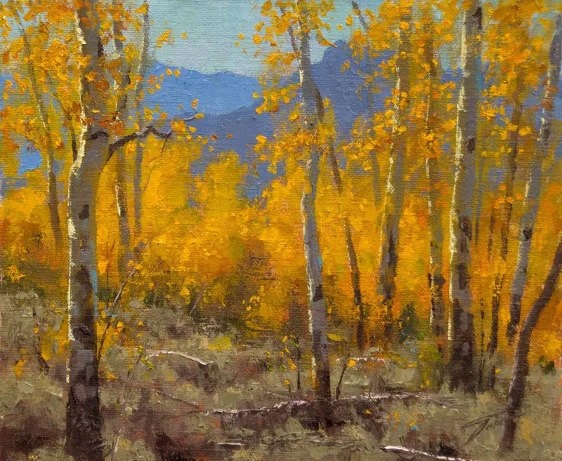
Of course, there are caveats to this concept. The first is sunrise and sunset when the sun briefly shines on the side of the trees rather than the top. Another would be bright yellow autumn trees with mountains or dark clouds behind them. There are more caveats but for the most part, the above rule applies.
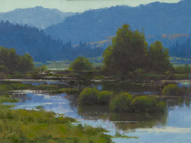
Trees are Green, But Not That Green
Now that we've talked about value let's talk about color. Green is one of the most difficult colors for artists to manage. So many artists, both beginning and experienced, paint their trees (and other things in nature) too green. Once again this tends to come from our habit of naming things rather than really seeing them. Trees are green (at least in the summer) so we grab a tube of Sap Green, or Viridian, or Chromium Green Oxide, or even Thalo Green, then load up the brush and start painting a gaudy form that looks more like a Bob Ross Chia Pet gone punk than a natural tree.

On a typical summer day, most of what we see outside is not nearly as green as we think. I would argue it's closer to gray with a strong green bias than what comes out of our tubes of paint, even those tubes that claim to be a natural green. This means you need to neutralize your greens with some type of red.
One of my favorite color combinations is Viridian (a very bluish-green) mixed with generous amounts of Burnt Sienna and Cadmium Yellow Light or Yellow Ochre. Another suggestion is to remove all manufactured greens from your palette and mix your greens from Ultramarine Blue, Cadmium Yellow Light (or any yellow you prefer), and Cadmium Red. Mixing these three together will get you to a more natural green faster than most anything else.
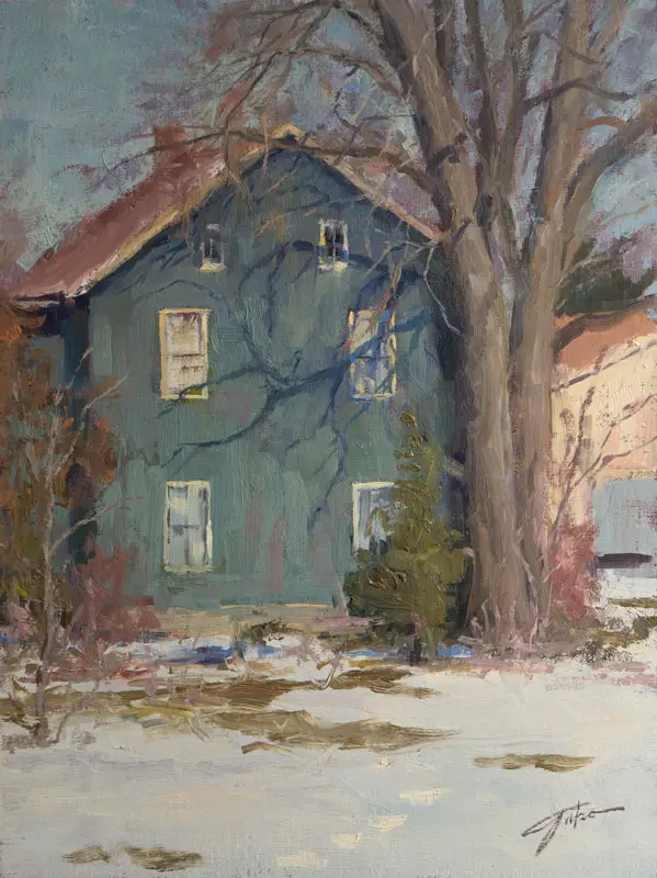
Don't Paint Your Wood Brown
As children, we painted our tree trunks and branches brown. In reality, they are usually more gray than anything else. Most of the time a warm gray, but gray nonetheless. This gray is elusive and can even be on the cool side in certain situations.
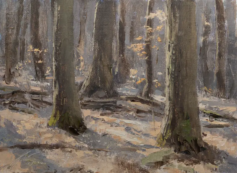
Your best bet is to start with burnt sienna, ultramarine blue, and white, mixing different proportions of each color until you get close to the gray you are seeing. Ask yourself how warm (burnt sienna) or cool (ultramarine blue and/or white) the trunk and branches are compared with the other colors in the scene. Most important is to ask yourself how light or dark (the value) the wood is compared to what's around it.
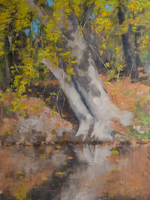
Twigs are Lighter than Trunks
Another elusive concept for beginners is the principle of diffraction and how it affects paintings and drawings of trees. Without going into hard-core physics, diffraction from an artist's perspective basically means that the smaller an object is, the more its value and color will be influenced by the values and colors that surround it. That is because a smaller object will have more of the surrounding light and color wrapping around it and influencing it.
While it applies to any subject, diffraction is easy to spot in a defoliated tree with the sky as a backdrop, especially if you look at the tree while squinting. The thickest part of the tree (usually the trunk) will be the darkest part of the tree. As you move out to the thinner branches, they will get slightly lighter in value, and the thinnest twigs will be even lighter in value, sometimes barely darker than the sky. In fact, a clump of thin twigs can appear more like a blur with soft edges.
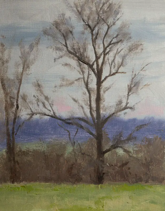
This can also affect the color as well. If the backdrop of the defoliated tree is a brilliantly colored sunset, the thin twigs can take on the warm hue of the background sky colors, while the thicker branches and trunk will maintain their darker value and cooler color. If the sky is blue or overcast gray, the thinner branches will become slightly cooler than the thicker branches.
Summer trees are also affected by diffraction, though usually not as much. Small leaves or smaller groupings of foliage on a tree may be slightly lighter in value than the main mass of foliage. Many artists make the mistake of painting their defoliated trees the exact same value from trunk to twig, which gives their trees an artificial, pasted-on appearance. Look for diffraction in nature and paint it accordingly and this problem will be solved.
Painting diffraction can be easy when using a wet-on-wet paint application method. If you have already painted your sky and that color is still wet, you can take some of the tree color and carefully drag it into the wet sky color to lighten it. You can also add some of the sky color to the tree color on your palette and lighten it before you add it onto your canvas.
Make Your Sky Holes A Bit Darker
Sky holes are the openings we see in a mass of tree foliage that reveal the sky (or mountain, or other objects) that is behind the tree. So technically they are not always "sky holes" but that term is used to keep things succinct. Once again, the principle of diffraction applies here: the smaller the sky hole, the darker it is. This is because the smaller hole is surrounded by darker foliage and will therefore appear darker. If you use the exact same color and value for your sky holes as you did for the main part of the sky, these holes will look pasted on and not part of the scene.
Two solutions for making your sky holes a little darker is to mix a darker version of the sky color and paint it in the spot you want it to go. The other is to use the original sky color and carefully blend it with the foliage color with a wet-on-wet paint application. This technique requires more skill and can sometimes result in a muddy, over-blended disaster, and is only recommended for more experienced artists and when the color of the foliage and sky are close on the color wheel, such as cool green foliage and blue sky.
Sketch, Sketch, Sketch Trees!
Learning how to draw or paint convincing trees doesn't happen overnight. Like anything else it takes practice. So get yourself a sketchbook and sketch trees on a daily basis in all different types of lighting and seasons. Focus on the shape and form of the whole tree, starting with a rough contour of the big shapes, then working your way to smaller shapes, all while maintaining a feeling of form and volume. Pay attention to diffraction, especially in defoliated trees. By the way, you can sketch with oil paint, watercolor, or whatever paint you like. Don't try to paint the entire landscape, just focus on trees for a while.
If you would like to study under me and learn much more click here to be added to the Priority List for my live online classes!
Jason Tako
Oil Painting at Home
www.JasonTako.com
Warning: Undefined array key "preview" in /home3/mysketc2/public_html/wp-content/plugins/oxygen/component-framework/components/classes/comment-form.class.php on line 75
Warning: Undefined array key "preview" in /home3/mysketc2/public_html/wp-content/plugins/oxygen/component-framework/components/classes/comment-form.class.php on line 79