16 Essential Skills Needed To Create Great Artwork
If you are starting out, or even if you have been an artist for a while, it can be challenging to know what skills an artist should have in order to create beautiful and great looking artwork. Know what to work on can be a tremendous help. In this article, we will discuss the 16 essential skills needed to create great artwork and where you should start.
Artists Should Learn Drawing First
Drawing has a broader term than just making a mark with a pencil. It means making the right shape, making that shape the correct size in proportion to the other shapes in the picture, and sticking that shape in the right place.
Let's say you have drawn a set of eyes and next you are going to draw the nose. You first need to draw the nose the correct shape so that it looks like a nose and looks like the nose of the particular person you are drawing or painting.
The nose also has to be the correct size when compared with the eyes that you have already drawn. If you were only drawing a nose you could make it whatever size you want as long as it fits on the paper. But since you are combining it with a set of eyes on a face, you now have to make sure it's the correct size in proportion to the eyes. This is accomplished by comparing or measuring the size of the nose with the eyes.
Then you have to stick the nose in the right spot on the face, which of course would be with the top of the nose between the eyes.
This may all seem pretty obvious when you are reading it, but it can be easy to forget this process when actually drawing. Drawing is really all about making shapes and measurements of proportions. And in the context of realistic art it must be done whether you are using a pencil or a brush.
When Drawing Isn't As Essential (But Still Essential)
Drawing, good or bad happens whenever you make a mark on paper or canvas (or anything), regardless of whether you are drawing a person's face or a simple landscape. But some subject matter requires a higher level of draftsmanship than others.
Drawing country landscapes (while they require some sense of proper linear perspective and a tremendous amount of aerial perspective) is not nearly as demanding as drawing a portrait. If you move a tree branch down an inch it probably won't be an issue; if you move the nose of a beautiful woman down an inch (or make it too big or small) it's a very big deal. So depending on what your subject matter is will determine how refined your drawing skills should be.
Drawing is Where It All Begins
For the representational artist (one who tries to paint some semblance of visual reality), drawing is the most fundamental skill you can acquire. It doesn't matter how beautiful the color, how proper the value, or how sophisticated the edge if it's stuck in the wrong place or its the wrong size.
As stated above, your subject matter and style may not demand absolute precision. Monet's paintings were all about color and had very little draftsmanship; John Singer Sargent's work was the complete opposite. But you must acquire the level or drawing that your subject matter demands.
Where To Start Learning to Draw
The best way to learn how to draw is to draw. Draw all the time when starting out, and draw anything you can get your hands on; anything that will challenge you. I have an article about choosing the right subject matter to improve your drawing skill.
I highly recommend The Charles Bargue and Jean-Leon Gerome: Drawing Course, especially if your subject may include the human figure. It's actually a book that is a collection of drawing plates that were used extensively in the 19th century to teach students very refined drawing skills. There is also The Natural Way to Draw by Kimon Nicolaides, the book that got me started, and for drawing with paint, Richard Schmid has a great chapter in his book Alla Prima II. All three can be seen in my article Books that Changed My Artistic Life.
Learn Values Before Color
Values are the lightness and darkness or either a gray or a color. It is the second most important thing to master since it is the dominating principle behind contrast. Contrast is the reason why we can see anything at all.
This is illustrated by the classic joke about showing a blank canvas and claiming its a painting of a polar bear in a snowstorm. While obvious hyperbole, it does illustrate that you could not see a completely white object if it were surrounded by a completely white background. And this is because it would completely lack contrast.
But values go much further than just defining objects and shapes of light and dark. A proper understanding and use of values will give your work a three-dimensional look. When representational artwork looks flat, it's almost always because of incorrect use of values. The darks are not dark enough, or they are too dark. And the lights are not light enough or they are too light. Values can be very elusive to the beginner.
Color Has Value
Values are extremely important when using color. It can be argued that they are more important than the color itself. Each color has its own value, which is how light or dark the color is. Blue can be dark in value, but it can also be light by adding white. When artists are having issues with color it can usually be attributed to improper value.
Working With Values
The painter should remember that the full range of values are usually not required to make a good painting. The most intense light and dark (and chroma) should be avoided until the end and used only sparingly as an accent. This will give the painting more harmony. The most beautiful paintings usually have a very limited range of values.
One trick that I use when plein air painting (painting on location) or even when using photo reference in the studio is to look at my subject and my painting through a piece of red transparent pexiglass. This turns all of the colors into values and allows you to see which parts of your painting may be too light or dark as compared with the subject matter.
One of the most thorough treatments of values that is easy to understand is given by Richard Schmid in his book Alla Prima II. See my past article to learn more and where you can find his book.
Understand How to Use Color
Color is one of the fundamental reasons many people take up painting. It's beauty can be almost seductive and for Impressionist painters it's probably the sole reason they paint. Color is also the thing many artists struggle with the most. As stated above, when there is a color problem it can usually be attributed to incorrect values.
Besides value, which is the most important aspect of color, there is hue and chroma. Hue is just what color family the color belongs to, such as blue, yellow, etc. Chroma is how intense the color is, such as a dull red compared to what is called candy-apple red. All three, value, hue and chroma, must be taken into consideration if color harmony it to be achieved.
How to Think of Color
When I first started painting, I tended to think of and try to categorize every color I needed to mix with names. For instance, I would call a deep, muted red Burgundy, and a bright, intense red Cherry Red. This kind of thinking is very limiting since we can never develop, much less remember, names for all the millions of color variations in nature. It also tends to make us think we can buy a tube of paint to cover every color we will need.
Rather than use names such as Burgundy, we should think in terms of value, hue and chroma. So Burgundy becomes a cool/blueish red (hue), that is dark (value), and somewhat muted (chroma).
Thinking this way about color allows for a better understanding of what must be adjusted in order to paint your subject faithfully. Rather than hitting a dead end when Burgundy doesn't work, you can ask yourself which aspect of the color needs to be adjusted.
Color Formulas
There are a number of color theories and formulas out there that promise great results. These have their place, but when it comes to representing reality they are severely limited. Nature doesn't conform to a triadic color scheme. At times you may find it in nature, but if you try to make nature always conform to a preconceived formula you will not only end up with different colors than what's there, but you may miss seeing what is there completely.
I think formulas and theories are great for enhancing your paintings and adding a dash of interest, and some artists will completely change nature's colors to conform to a preconceived idea or theory. There is nothing wrong with this as long as that is the intention. Just be aware that no color formula will be able to solve every color problem if your desire is to paint nature as it is.
Learning Color
There are a lot of great books on color, and the subject is way too deep to tackle in this short article. I have to say that the book that helped me the most was once again Alla Prima II by Richard Schmid. He dives very deep into the subject yet keeps it clear and even fun. See my past article to learn more and where you can find his book.
Understand Light Temperature and Type
Light Temperature
The temperature of light ties directly in with color and is one of the primary influences of color. Light has temperature, meaning that is can be very warm (yellow/orange), or it can be very cool (blue). On the Kelvin scale light can go all the way from 1,000, which is candlelight, to 10,000 which is blue skylight. It's interesting to note that on the Kelvin scale, the warmer the light, the lower the number.

To get your color harmony correct, and to accurately paint the colors in your subject matter, you must know approximately what is the temperature of the light that is illuminating your subject matter. You do not need to know the exact temperature, so don't run out and by a light meter. You just need to know if the light is warm, cool, or near the middle somewhere.
Warm light will generally mean that the side of your subject that is illuminated will be warmer than the shadow side. Cool light will generally mean that the illuminated side will be cooler than the shadow side. I say generally because there are a number of anomalies that can occur.
So if you are painting a white ball in sunlight outside on a cloudless day, the illuminated side of the ball will have some warmth in it (yellow/orange) because the sun's light is warm, the shadow side of the ball will be cooler, meaning that it will have some coolness (blue) in it.
This doesn't mean that the lit side will be orange and the shadow side will be blue, it just means that the lit side will have very little if any blue and the shadow side will have very little orange and way more blue in it. So with warm light, you generally have warm light areas and cool shadows. And if the light is cool, your light areas will be cool and your shadows warm.
There is much more about this subject, and as said there are many caveats, but this is the general rule.
Light Type
There are generally two types of light the artist needs to be aware of, direct light and diffused light. Direct light would be the type of light you get from the sun on a cloudless day or the light of a bright spotlight. This type of light creates cast shadows, the type of shadows that mimic the shape of the object creating it and have very defined edges
Diffused light is the kind of light you get on an overcast day or from blue sky light, which is the light that the blue sky creates within the shadow of an object (Think of being on the shadow-side of a large building or mountain. That area, while not in the sun, is illuminated by the very cool blue light that the blue sky gives.) In diffused light you will not have cast shadows. Rather the shadows will be very soft and barely noticeable.
So to put is all together, for outdoor subjects, warm light is usually associated with hard, cast shadows, and cool light with soft, diffused shadows.
Variety of Edges is Essential for Great Artwork
Edges are not even a consideration for many beginning artists, but they can bring magic to your work. Variety of edges can give your work realism and interest and can help emphasize form. Variety of edges also mimick how the eye actually sees. In our field of vision, only the things we look at directly appear to be sharp. As you move out to your near-peripheral and far-peripheral field of vision, edges get blurry.
The three different types of edges are hard, soft, and lost, with many degrees between each. Each one has its place and function and can complement the type of form as well as values, colors, and movement. It's always a good idea to reserve your hardest edges for the focal point in your artwork and keep the edges on the edge of your composition somewhat soft so they don't divert attention away from the focal point.
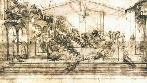
Understand How to Make Good Composition
Composition is one of those concepts that artists struggle with all their life. Once an artist has mastered drawing, value, color, and so on, they will still agonize over composition. Composition is usually the reason master artists will abandon an idea or a painting. But please don't take this as discouragement, it's actually one of the things that keeps an artist interested in art and challenged after many years of being an artist.
While drawing is making something the right shape, size, and sticking it in the right place, composition is not nearly as objective. Good drawing skills will tell you if you drew a woman's nose in the wrong place on her face, but good composition will tell you if the woman is in the right place on the canvas. Drawing is almost always objective, while composition is usually subjective, which is where the challenge comes in.
Composition is all about creating a pleasing arrangement of shapes, colors and values in your artwork-nothing more. And while there are formulas and rules that can be helpful, especially when starting out, know that every single one of those rules has been broken by some artist who made a pleasing composition during their rule-breaking.
That said, if you are new to drawing or painting, it's always a good idea to accept a degree of humility and learn the rules and principles before you break them. There are many good books out there, but you can start by just doing sketches of paintings you like and try to figure out why you like them.
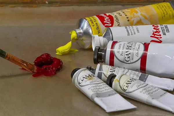
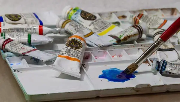
Master the Technique of Your Chosen Medium
You can't hit a home run if you don't know how to properly swing a baseball bat. And you can't paint a masterpiece if you don't know how to use your paints and brushes correctly. Good technique means knowing how to handle your materials and knowing exactly what those materials will do when used a certain way.
While most everyone knows that blue and yellow will make green, many people don't realize that Viridian Green mixed with Alizarin Crimson and some white will make a beautiful cool lavender color. This is a case of intimately knowing your pigments.
If you are an oil painter you need to know about the principles of fat over lean paint application. If you are a watercolorist you need to know how wet your paper should be to achieve the effect you desire. You also need to know the different types of brushes and what they will do.
You don't need to obsess over every technique available and know every single tool or paint mixture. Part of the joy of art is learning new things as you progress and trying new techniques. Also, much of this knowledge can only be gained through trial and error and experimentation. Just realize that you cannot expect advanced results until you have some handle on your technique.
Draw and Paint From Life as Often as Possible
If there was only one bit of advice I could give to my students, it would be to draw or paint from life as much as possible. Photographs, as helpful as they can be, are not life. A camera takes all the bigness, motion, and variety of life and squishes it down to a small, frozen, sterile rectangle.
Cameras, even the most advanced, do not record colors or values the same way the human eye does. For all the advancements that cameras have made over the years, the human eye can still perceive much more hue and value variety than a camera can capture. Also, when looking at a photograph, you are looking at a 2-dimensional representation of our 3-dimensional world that was created by a mindless machine that doesn't have your emotions or ability to express.
Probably worst of all, the photograph can enslave you into a mentality that your artwork will only be good if it imitates the photo as much as possible. Nothing will do more to suck your creativity away than submitting to this mentality.
Please don't get the idea that I'm totally against photos. This is far from the truth as I use photos for almost all of my studio work. What I advise against is relying exclusively on photos for the totality of your artistic being. An artist who wants to draw or paint reality should have consistent artistic contact with reality, not just a machine's interpretation of reality.
Get a sketchbook and draw from life, or get a pochade box setup or a French easel and paint from reality. I promise you that you will paint some disasters, just like I did and still do. But to work from life is to observe and internalize life from an artistic perspective, and that is the goal, not having a pretty painting to post on social media. Doing this on a regular basis will put you on the fast-track to being a master artist, even if you end up painting from photos in the studio.
Understand Linear Perspective
The first half of the depth equation, understanding of linear perspective, also known as classical perspective, is necessary for establishing a sense of depth and realism in your work. It is basically creating the illusion that objects that are further away actually recede to a vanishing point, and that your composition has depth. If you get this down, along with aerial perspective (see below), it will make the viewer feel like they can walk right into your artwork.
While perspective can become quite complex with vanishing points, lines, and grids, it doesn't need to be. In fact, trying to do this can sometimes make your work look less realistic since there are many times when a vanishing line will not be within the boundaries of your paper or canvas, and having them within those boundaries would create an unnatural and exaggerated perspective.
If you essentially match the angles of things you are seeing in life, then linear perspective usually takes care of itself. Yet this is much easier said than done, especially with things like interiors and complex architecture. One book I found very helpful that didn't over-complicate the matter was The Art of Perspective by Phil Metzger. Also, drawing from life will help you to get a feel for perspective in reality.
Master the Use of Aerial Perspective
The second half of the depth equation, especially for landscape artists, is aerial perspective. This is showing depth and distance in your work through the proper use of values and colors.
While there are many aspects and caveats to this principle, the basic concept is that shadows and dark objects get lighter in value and cooler in color temperature the further they recede. In regard to color, a good rule to go by is that as things recede, yellow is the first color to diminish, followed by red, which then leaves blue. This is because of the effect the atmosphere has on color.
So let's say you are painting some trees that are very close to you as well as some trees off in the distance. The contrast between the light and shadow areas of the trees will be greater in the foreground trees since the shadows are darker. In the distant trees, there will be less contrast between the light and shadow side of the trees because the shadows will be lighter in value.
Continuing with the tree example, the foreground trees will have more yellow in the light areas and more warmth in the shadow areas than the distant trees. Those distant trees will have less yellow in the light areas and more blue in the shadow areas. This just scratches the surface of aerial perspective. If you want to learn more, I highly recommend John F. Carlson's Guide to Landscape Painting.
Ability to Gather Sufficient Reference Material
This one may surprise you as it's not a skill they would normally teach in art school, but in my years of painting, I've learned the hard way that not having sufficient reference material, or the ability to obtain it can make a drastic difference in your work.
I've seen many art students try to do masterpieces from really bad photos where you could barely see the subject matter. When it comes to painting realistic work (unless you are incredibly familiar with your subject), if you can't see it, you can't paint it.
Reference material can be anything from sketches, paintings done on location and/or photographs. It's important to get the best and largest amount of reference material possible in order to make quality works of art.
If you work from sketches or plein air paintings, that means doing some good sketches and maybe even several of the same or similar subject matter under the same lighting conditions. If you work from photos, that means taking way more photos than you think you will need, especially if your subject is something like an animal that moves and will exhibit many different poses and gestures. It also means knowing how to take good photos and knowing what to do with those photos in your studio.
My preferred way of working is with a combination of sketches, field studies and photos. Many of my paintings end up being a combination of sometimes 20-30 different photos along with field studies. I've found that sometimes the slight angle of a person's head or arm can make all the difference in a good composition.
Take way more photos than you think you will need. It's way better to have them and not need them than to wish you had them and compromise on your artistic idea. Also, learn how to work your camera well and learn the basic principles of photography. There is a wealth of information on the internet on this subject. Google how to use your camera model and It's pretty much guaranteed that there will be some free instructional videos on YouTube.
Learn to Edit Your References and Paintings
Now that you have good reference material, you need to know what to do with that material. There is an art to knowing how to edit your sketches or photographs in order to create a pleasing composition and realistic-looking work.
Nature almost always gives the artist more than he or she needs. Your job is to know what needs to go, what needs to stay, and what needs to be changed. Sure that tree may have actually looked that way as the photograph clearly shows, but that doesn't mean you can't and shouldn't make it look better.
Perhaps you want to draw a running horse and you love the angle of the head in a particular photo but the legs look weird. In that case, you should change the legs to make them look better. This is where taking way more photos than you think you will need becomes so important.
When combining references from different locations, its ultra-important that you make sure the lighting in those references is reasonably similar and from approximately the same angle, or that you paint them that way if you are skilled enough. You don't want to have an elephant that was photographed in overcast light placed in a perfectly sunny landscape.
Develop Your Artistic Inspiration
Some mistakenly think that inspiration is some magical thing that comes to you from some mysterious place. While this can happen, inspiration is also something you can and should develop. The best way to do this is draw or paint what you love. If you'r not sure what that is, take some time to think about what excites you, what you find beautiful, even if you have to go all the way back to your childhood.
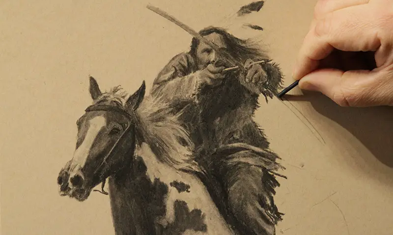
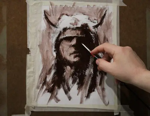
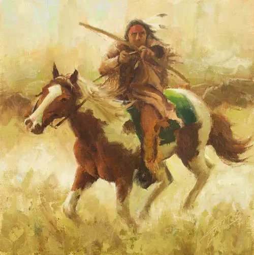
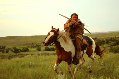
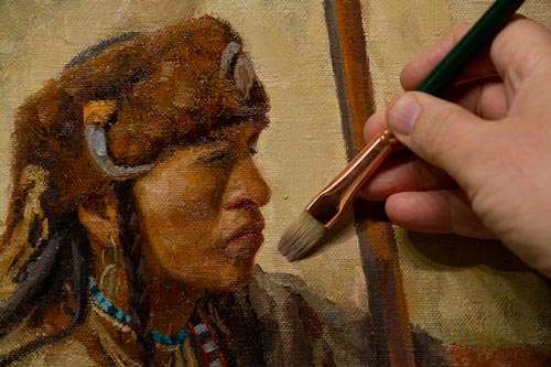
What inspires you may change over the years. I started out doing mostly wildlife. I also dabbled with figurative work, still life, and did lots of landscapes. It wasn't until years later that it all came together in the historical Native American work I'm doing and loving today.
Keep in mind that your inspiration may not be so much subject-matter related as it is style-related. Many artists will paint anything as long as it's in their style. The subject is just a vehicle for them to express their inner-selves with their chosen medium. That said, if you are stuck in the mud when it comes to inspiration, try a new medium. That alone may be enough to get you fired up again.
Critically Assess Your Results
While inspiration is of utmost importance, you must be able to balance inspiration with a critical evaluation of your work. Just be careful. Looking down on everything you do is just as damaging as thinking you have no room for improvement.
To do this properly you need to conduct a sober self-assessment of where you currently are in your skill level and career. If you are just beginning, then you must consider any serious effort as a victory. This is because if you compare yourself to Rembrandt at this stage you will end up in perpetual frustration.
If you are an experienced painter wanting to asses your work, I recommend putting any almost-complete work away for several days or even a couple weeks and then looking at it with a fresh eye. It's also a good idea to have several works in different stages going at once. This will help keep your eye fresh and yet still maintain productivity.
When you look at your work, try to break down any problems into a technical problem that needs to be solved. If your painting looks flat, you probably have a value problem. If the face doesn't look like the model's, then it's a drawing problem. If the painting looks stiff, it's probably a problem with edges, values, and perhaps drawing. Breaking any issue down into technical terms helps you solve the problem and avoid beating yourself up.
Establishing Your Artistic Voice
This doesn't happen for a while, and you don't want to try too hard to get there because then it won't happen naturally, but you do eventually want to arrive at your own voice or style of work. Most any successful artist has developed a style that is instantly recognizable. As indicated above, sometimes this is strongly tied to a particular subject matter, other times subject matter is somewhat irrelevant because the style is so strong.
Those little imperfections that you constantly see in your work that are not "mistakes" may just be your voice trying to cry out. Try taking those little things and turning them into something positive. For example, maybe you aim to have more color in your work but it always ends up being more muted. It may be that a muted palette is your natural voice. Try working with that palette and seeing if it can become a strength for you rather than a hindrance.
Developing a Production Process
I know, I probably just ruined the whole thing by bringing up pragmatics, but most good artwork is born of many hours and years of consistent production. Even if you don't go heavily commercial, or commercial at all, you still want to have some process in place that will keep you disciplined and engaged. It may be only an hour each day, it may be 10 hours a day, but develop some type of routine or schedule to allow yourself to create.
I heard it once said that you have to make about 10,000 mistakes before you become a good artist, so why not hurry up and get them all made? You will then be that much closer to creating the work that is inside you screaming to get out.
Jason Tako is a nationally known fine artist who specializes in western, wildlife, plein air, and Historical Native American subject matter. He spent his learning years sketching the wetlands and wooded areas of rural Minnesota. He has been featured in Plein Air Magazine and Western Art Collector Magazine and he was the Featured Artist for the 2020 Southeastern Wildlife Expo. See his work at www.JasonTako.com and his demonstrations on his YouTube Channel.
Warning: Undefined array key "preview" in /home3/mysketc2/public_html/wp-content/plugins/oxygen/component-framework/components/classes/comment-form.class.php on line 75
Warning: Undefined array key "preview" in /home3/mysketc2/public_html/wp-content/plugins/oxygen/component-framework/components/classes/comment-form.class.php on line 79