Eight Secrets for Good Sunset Paintings
Painting sunsets is something many artists enjoy doing. The beautiful, intense colors, simplified foreground, and dramatic clouds beckon us to pick up our brushes and make our best attempts to capture that gorgeous but fleeting moment. However, there are many mistakes that beginning and even seasoned artists can make that will ruin their sunset paintings. In this article, I'm going to discuss some of the most common mistakes made in sunset paintings and how to fix them. Click here to see a video demonstration of the concepts below.
Add White to Your Sky Colors
Probably the biggest mistake that beginning artists will make when painting a sunset is to use their colors at their fullest intensity straight out of the tube. They look at that beautiful sky and will squeeze pure Cadmium Orange, Cadmium Yellow, Cadmium Red, Scarlet Lake, you name it, right from the tube and onto their canvas.
There are several problems with this. The first is that skies are almost always very light in value. While Cadmium Yellow is by nature light in value, Cadmium Orange and especially Cadmium Red are usually too dark in value to work in a sky without some modification. According to John F. Carlson (and he knew his stuff), the sky should almost always be lighter in value than any other value plane in a landscape. Adding a middle-range values like pure Cadmium Red is just too dark for most skies.
The other problem is that, believe it or not, these colors straight out of the tube are usually too intense, even for a sunset. We think that the evening sky is really intense but that's because we are subconsciously comparing it to the very muted trees and foreground. These muted colors make the sky look really intense. And if you paint your trees with an intense green, you make the problem even worse.
So how do you tone down the intensity and lighten your sky colors? Start by adding white, usually a lot of white, to your sky color mixtures. This will make them look more pastel-like on your palette, but that is how skies will appear in most situations. There is more to it than this, and my video demonstrates this better than I can describe it with mere words, but not adding white, or enough white, usually results in big problems when painting skies.
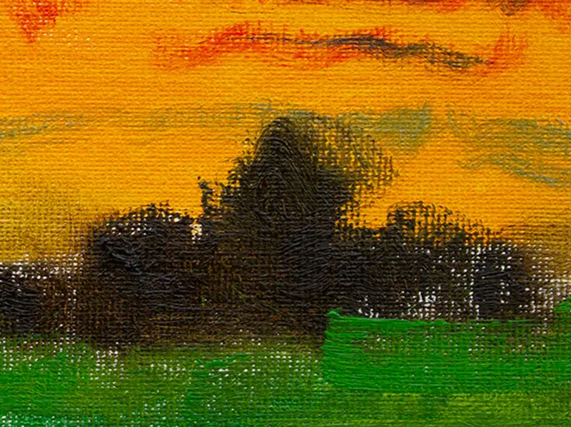
Don't Make Clouds Too Dark
This ties right into the above section, but it deserves emphasis. Unless there is a massive storm moving in with heavy cumulus clouds, clouds are not nearly as dark as you may think. Once again, don't use pure, dark purple, instead, add a lot of white. Your clouds should usually be darker than the rest of the sky, but only a little bit darker, and never as dark as your trees.
Don't Make Your Foreground Black
You see it all over, sunset paintings with everything in the foreground silhouetted. This may have some charm when it comes to decorative art, but it's rarely the case in reality. Those trees have some color in them, they are not black. And the ground plane should be even lighter in value and also have some color. In fact, don't use manufactured blacks (such as Ivory Black) at all, unless you really know what you are doing. Try using colors to mix your darks. See my article on How to Make the Color Black Without Black Paint.
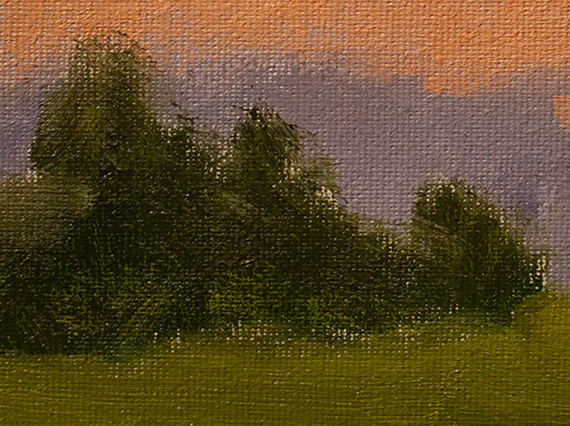
Tone Down Your Foreground Colors
Another big mistake beginning artists make is if they are not painting their foregrounds black, they are usually painting them with intense greens or other colors like reds, blues, etc. The more intense you make your foregrounds, the less intense your sky will look. Once again it's all about relationships. A neutral foreground will make your sky look more colorful; a saturated foreground will compete with the colors in the sky and make them appear less colorful, forcing you into a no-win color scenario.
Paint Your Clouds with Slightly Soft Edges
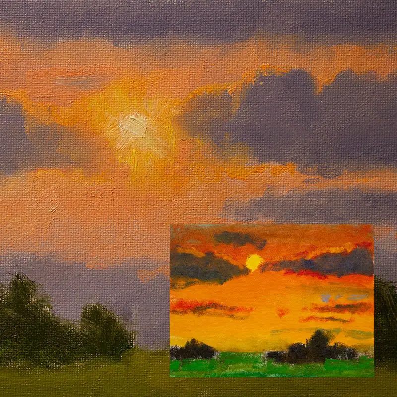
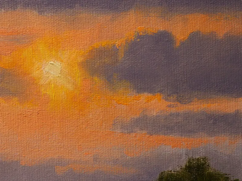
Clouds are water vapor, they don't have solid edges, so don't paint them with hard edges. I've seen a number of sunset paintings with thin cirrus clouds that look like they could cut right through the canvas. Make the edges of your clouds slightly soft. Also, if you have the sun in your painting make that slightly soft as well. You can even make it an undefined light shape to emphasize the effect of light that is so glaring it obscures the sun's circular shape (see images toward the beginning of this article.)
Use At Least Two Paint Brushes
A sunset, like most landscapes that show the sky, consists of two main bodies of saturation, a sky made up of very clean colors, and a foreground made up of neutral, earthy, and even "dirty" colors. One of your primary objectives should be to keep the clean, pure colors from being polluted by the earthy colors and vice versa.
One of the best ways to do this is to use one brush for the sky, and another for the foreground. I like to call the sky brush a clean brush, and the foreground brush a dirty brush. I never use the dirty brush in the sky or vice versa, unless I have completely cleaned them, and I mean giving them a good, final, end-of-session cleaning to make sure all pigment has been removed. Of course, doing this is not practical when you are actually painting, therefore it's easier to just use two different brushes. This means buying two of each size brush you anticipate using for your painting.
I also make sure that if I've wiped my dirty brush with a paper towel, I don't use that same paper towel to wipe the clean brush. If I do, then I just end up getting all that earthy paint in my sky brush, which means game over, unless I give them a very thorough cleaning.

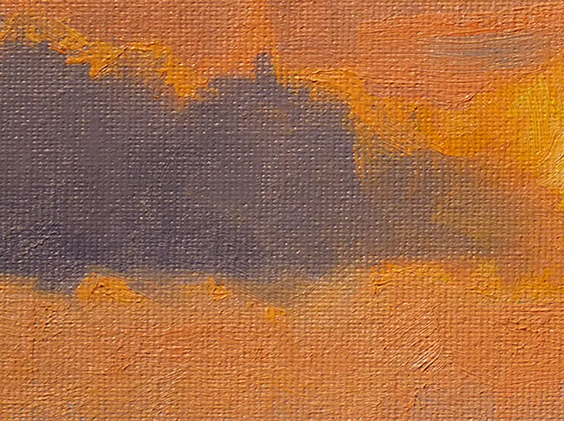
Don't Paint The Sky Behind the Clouds
Many beginning artists make the mistake of thinking that they must work strictly from back to front and in the process, will cover the entire sky portion of their painting with the sky color and then proceed to paint clouds on top of the wet sky color along with trees, etc. While you can do this while painting wet on wet, it takes a lot of experience and a pretty advanced technique to make it work without creating a big mess.
The better approach is to have a plan and know where your clouds and trees will be and paint the sky color around those shapes. That way when you go to paint those purple clouds, the color won't mix with the yellow/orange and create an obnoxious green tone. It also helps keep your dark foreground trees from getting chalky. Think more about painting shapes that you bring together rather than piling one layer of paint on top of another. It's a bit more tedious, but it's what the pros do and the results speak for themselves.
White-The Great Unifier
I hinted at this above, but using white in your sky colors not only helps tone down the intensity of the color, but it also has a unifying effect on your sky colors. When yellow/orange runs into red/blue, without any white, the results are usually some muddy brown or green color. But when you add a lot of white to both mixtures, it does a nice job of canceling out a lot of that obnoxious neutral tone with cleaner results. In essence, what the white is doing is turning your sky colors in pastel-like colors which is exactly what you want. It's very difficult to create mud with pastels.
Painting sunsets can be fun but also frustrating when you are new. Try to above concepts and see how they work for you!
If you are interested in studying these concepts in-depth, click here to check out my online workshops and demos.
Jason Tako
Warning: Undefined array key "preview" in /home3/mysketc2/public_html/wp-content/plugins/oxygen/component-framework/components/classes/comment-form.class.php on line 75
Warning: Undefined array key "preview" in /home3/mysketc2/public_html/wp-content/plugins/oxygen/component-framework/components/classes/comment-form.class.php on line 79