A Comprehensive Guide to Color Theory for Artists: Top 11!
Guest Article
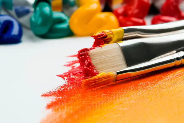
Looking for ways to bring that burst of life or dash of magic into that painting of yours? Or maybe just want to explore the amazing world of color in all its glory? Well, no matter the case, you have come to the right place!
We will be talking about the various kinds of shades and tones that make the world of art so beautiful and mesmerizing. So, hold your breaths, artists, as things are going to be super interesting!
Besides, for the artists, color is not just a random choice, instead, it is the language that communicates emotions and tells stories without uttering a single word.
Cannot wait to get into the details? We are equally excited to begin this colorful adventure as well!
1. Color Wheel
Imagine being handed over a brush dipped in every hue and told to paint to your heart’s content: No limitations or restrictions whatsoever!
That’s what you can do with a Color Wheel. It was first designed by Sir Isaac Newton in the year 1666. It is still used to create color harmonies and
palettes.
So, what is this color wheel again, and why is it a game-changer for the artists that they use it so much? Well, the color wheel is basically a visual tool that lets you organize the colors in a circle, demonstrating the relationship between them. And they are extremely important for mixing and matching colors that you need to create your masterpiece.
The basic color wheel consists of three things: primary colors (red, yellow, blue), secondary colors (green, orange, purple: the colors that are generated when the primary colors are blended), and tertiary colors (blue-green or red-violet: the colors that are generated from the mix-up of the primary colors and the secondary colors). And with their help, artists can better understand the context of harmony, contrast, and balance.
So, if you want to experience these cooler twists and learn how things work, you are always welcome to explore the free online color wheel to let your imagination go all wild!
2. Hue
Hue is that purest form of color that hasn’t been mixed with literally anything. In other words, they typically describe the dominant wavelength
color, ranging from red to orange, yellow, blue, or violet.
For instance, you might select a whole tube of ultramarine paint, which is blue, along with a bias towards the violet color. Here, the hue will be the color blue.
Why? Well, it is the most dominant wavelength of the pigment. In the context of color theory, they are a handy tool that organizes colors in a circle, making it super easy and convenient for artists to understand how they relate to each other.
Hue plays a significant role in conveying specific moods, themes, and messages through your art. Hence, as an artist, understanding the hues is of utmost importance. Otherwise, creating that depth and dimension in your work will be tough.
3. Saturation
Saturation is that spicy ingredient that makes the color appear the most vivid and intense. That is, they are the relative colorfulness of the light, which is totally independent of the brightness.
You can compare it with the volume knob of the TV remote for color. The more you crank it up, the more vibrant it will become. Similarly, the more you turn it down, the more the shades will become muted and subtle.
4. Tints, Tones & Shades
Tints are the ultimate result of blending a color with white. For instance, you are looking to create a soft baby blue. In that case, just mix up the color blue with white. Ta-da!
You have got yourself the soft baby blue. That much easier it is!
For the tone, it is a neutralized color that is created by mixing a small amount of its complementary color. They basically describe the lightness/darkness of the color and are mostly used to bring that calm and subtle nature into the canvas.
Lately, we have the shade – any color that is darkened is considered to be the shade. However, it doesn't mean that they are always blended with the color black. It can be any dark color. Perfect for creating a unique depth of drama and a slight touch of intrigue to the art.
5. Complementary Colors
Complementary colors are the pairing of hues, placed side by side, to create that stunning harmony that single colors will fail to give. They intensify each other and create a dynamic visual impact that is both vibrant and exciting.
For example, by placing a red object against a green background will certainly make the color red pop with full intensity, creating a powerful focal point in the art.
These colors are one of the most fabulous tools for artists as they offer a perfect balance and harmony in the work. And once you master it, you will find that every great artwork you make will turn into something unique and captivating.
6. Analogous Colors
Analogous colors are the colors that sit next to each other on the wheel of color. They are like best friends who don't think of doing anything without the other one. To be more precise, they share a common base color and help to create a soothing and harmonious vibe.
For instance, you are an artist who is working on a landscape painting. So, to capture a peaceful essence of nature, you will be picking various shades of green, from deep forest greens to fresh spring lead greens, along with some yellow, orange, and a touch of blue.
This color scheme that you will be using to create a gentle flow is nothing but analogous colors. Using them will only make things easier for the viewers to understand the various elements within the artwork. Much like your go-to when you want to create that sense of unity and simplicity in your composition.
7. Triadic Colors
Triadic colors are a trio of colors that are evenly distributed around the wheel of color, forming an equilateral triangle. Take, for example, red, blue, and yellow, they are like the classic ones who play together and possibly bring out the best version in each other.
They can literally make one’s artwork pop, from providing a super vibrant to a balanced contrast. So, whether you are working on a painting or a graphic design project, understanding the whole concept of the triadic colors can definitely take your creative endeavors to the next level.
However, one piece of advice: these colors can be pretty intense, so try to be a bit mindful of the balance, otherwise, it can be overwhelming. Something you will definitely not like!
8. Value
The value is the ultimate measurement of how light or dark a color will appear. You can either lighten/tint colors by adding white and darken/shade colors by including burnt umber/or using its complementary color.
For example, a grayscale, ranging from pure white to pitch black. Here, all the shades in between are the values.
Mastering this skill is extremely important in painting and drawing. Because without knowing how this works, you will not be able to create a realistic image – which is one of the most important things for every artist out there!
9. Color Bias
As we all know, every other color has a tendency to lean towards another color on the spectrum. For example, some reds might lean towards orange,
offering a warm and fiery vibe.
On the other hand, some may lean towards the color purple, offering a much cooler and regal feeling.
No matter the case, this color bias can be a total game-changer when it comes to blending in the colors. Only by knowing the tendencies of the pigment will you be able to make that harmonious color palette, with all the colors singing together.
10. Color Temperature
Color also has a different kind of warmth and coolness associated with it. And the thing that deals with this kind of situation is referred to as the color temperature.
In the world of art, the red, orange, and yellow colors are categorized as the warm ones, while the blue, green, and purple are categorized as the cool
colors.
Moving on, the warm colors are thought to have a connection with energy, brightness, and action, while the cool ones are thought to have a relationship with calmness, peace, and serenity.
Having trouble understanding? Well, let’s say you have a beautiful sunset painting with all the needed colors: orange, red, and blue.
So, here, the colors orange and red are the warm colors – providing the feeling of a fading yet beautiful day. The color blue (cool color) in the shadows brings in that calm touch of the evening. It is a perfect illustration of the color temperature in an artwork, setting a mood that resonates with the audience.
11. Gamut
Gamut? Well, the term may seem a bit complicated, but, in reality, it is pretty simple. In the world of color theory, it refers to the complete set of colors that are produced by a given color system/medium.
Different systems come with various gamuts; understanding them as an artist can really make all the difference. For example, digital artists work use RGB (Red, Green, Blue) color spaces to create vibrant and luminous colors.
On the other hand, traditional painters using watercolors have a gamut limited by their pigment properties. The reason? Well, knowing one’s gamut helps to make more informed decisions about which colors to go for and when. That is, which colors will work well together and which might clash.
Once an artist can master this, there is literally no turning back in creating masterwork that will grab attention and evoke emotions.
Wrapping Up
The world of color is a playground for artists where they are free to play around, explore, and bring out their creativity. There are just no restrictions!
After all, they are the language of emotions and, of course, your medium to speak to the entire world in the most beautiful way possible.
And now that you have a full understanding of color theory for artists, make sure to practice accordingly. Who knows, you might just create your next masterpiece sooner or later!
So, what are you waiting for? Keep learning and exploring as your canvas awaits your magical dreams – full of colors.
Learn More!
If you would like to learn how to practically apply color theory to your painting, check out my online oil painting workshops at www.OilPaintingPlus.com!
Warning: Undefined array key "preview" in /home3/mysketc2/public_html/wp-content/plugins/oxygen/component-framework/components/classes/comment-form.class.php on line 75
Warning: Undefined array key "preview" in /home3/mysketc2/public_html/wp-content/plugins/oxygen/component-framework/components/classes/comment-form.class.php on line 79